|
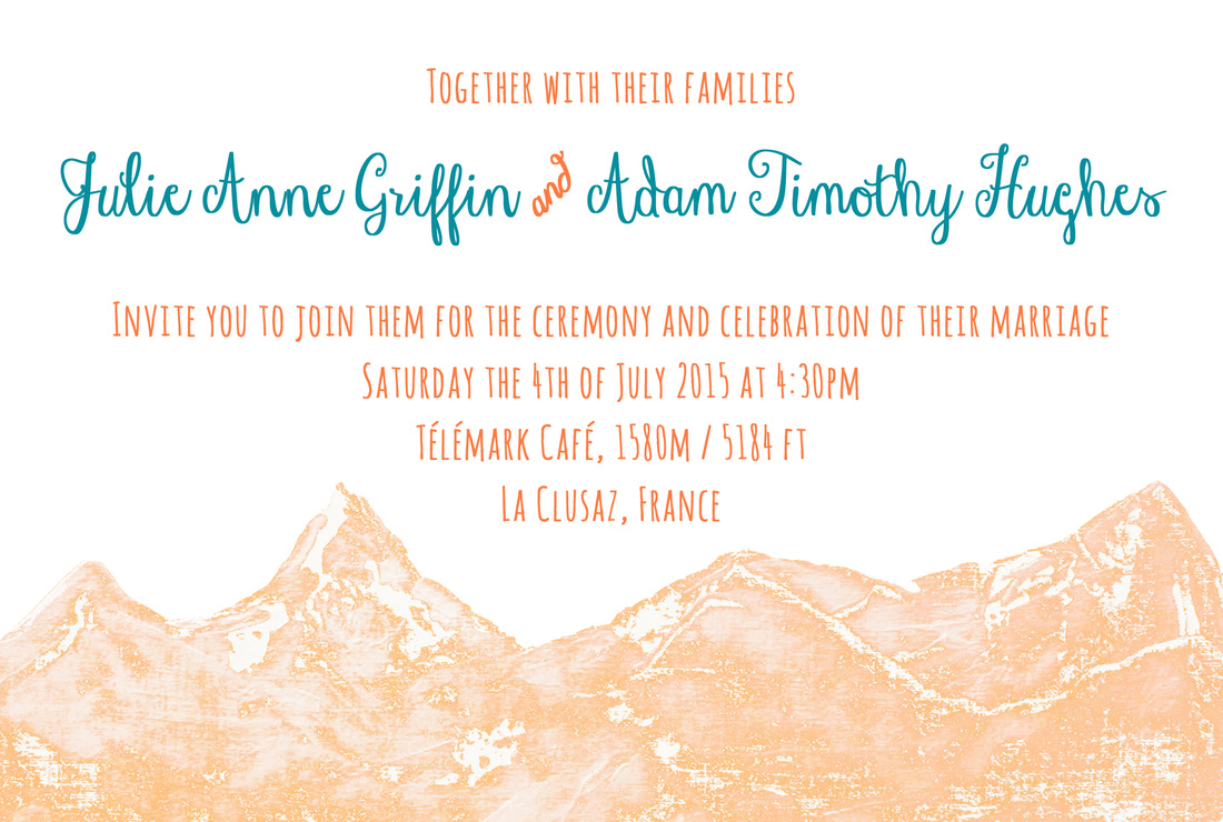
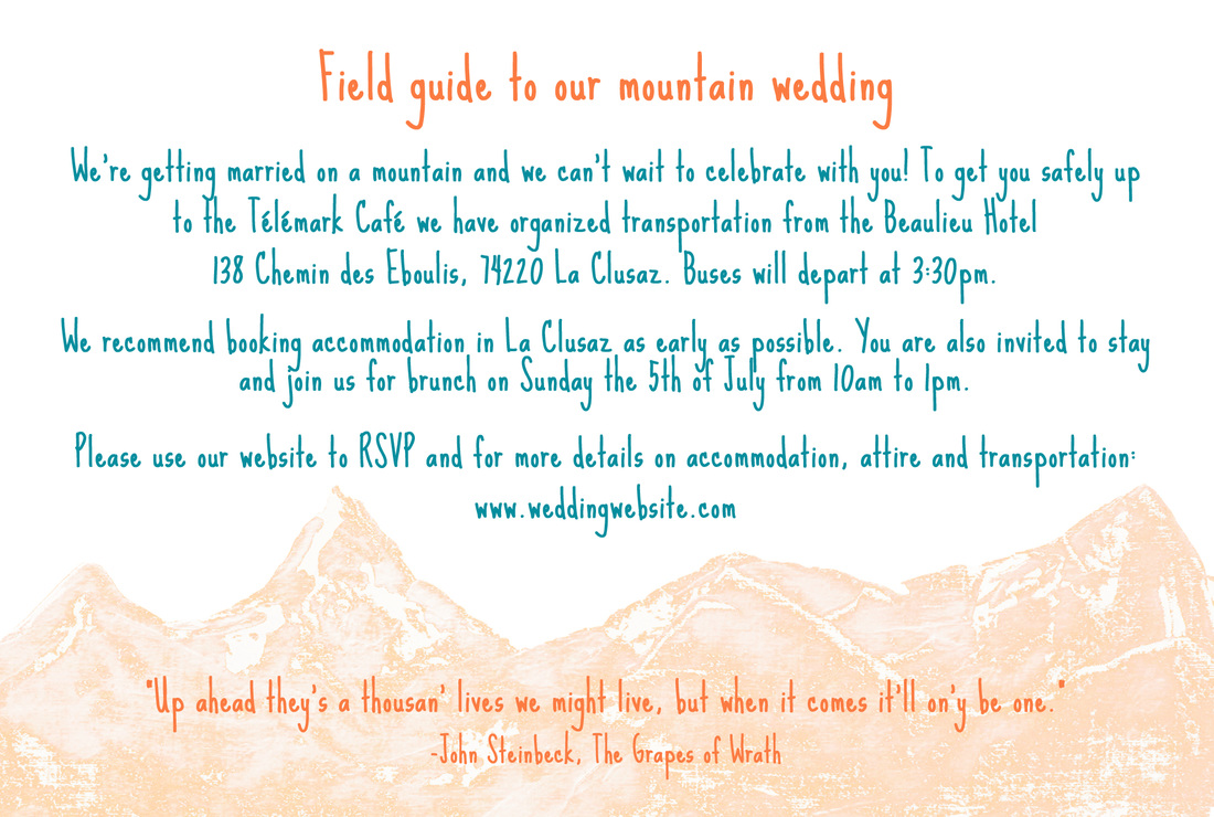
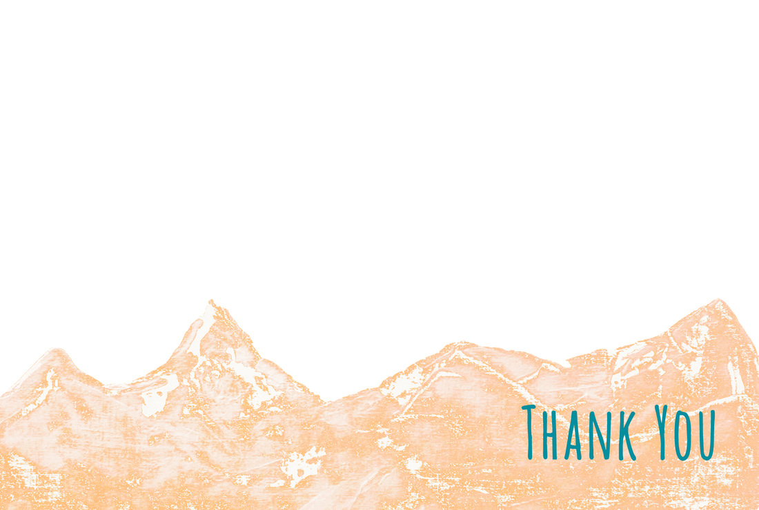
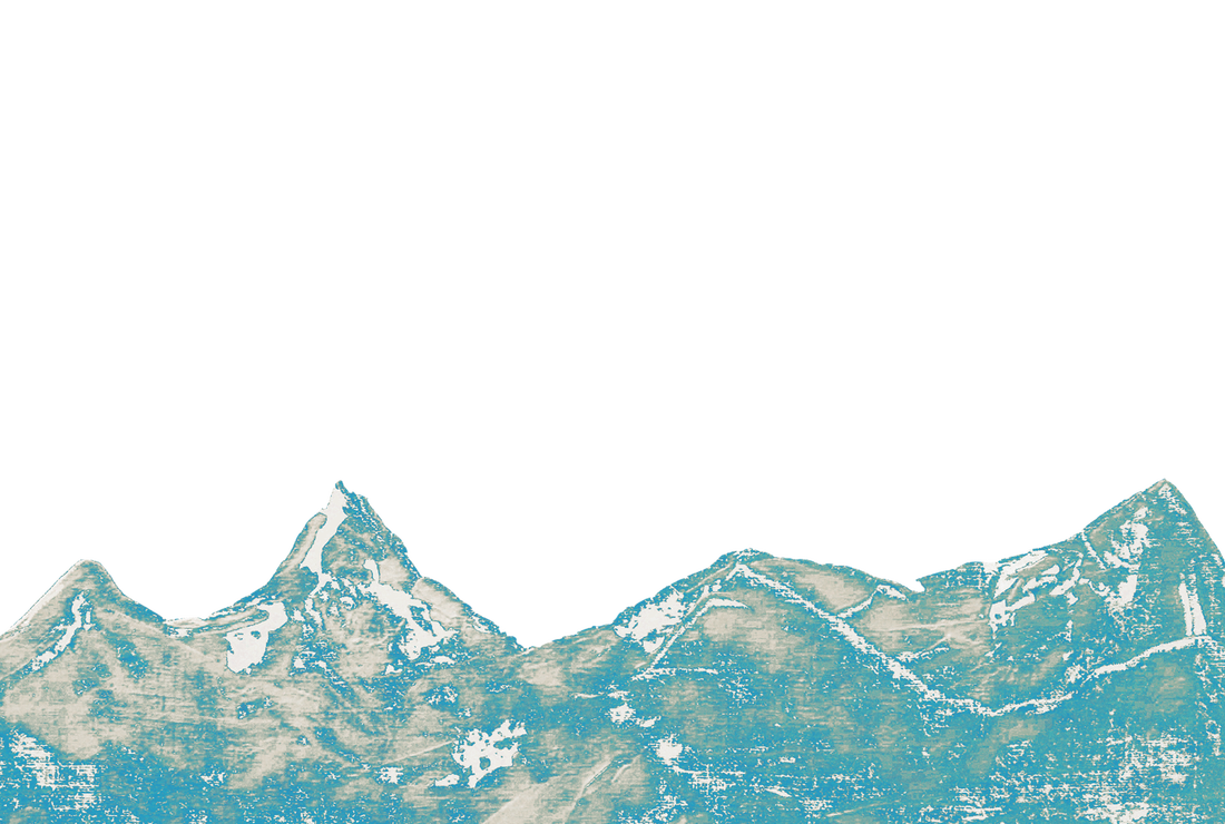
Last spring a college friend, Julie, asked me to design invitations for her wedding in the French Alps. She had seen the invitation suite I created for my sister's mountain wedding (here and here) and wanted a similar feel. While she had a concept in mind, she needed a designer to pull it together and polish it. The really neat thing about these invitations is that Julie's fiancé painted the mountain landscape. The original painting was in blue, but they'd settled on an orange and teal color scheme, so we played around with shades until we found the right combination. Above: Typically you stick to the same fonts throughout, but while Julie loved the all-caps font on the invitation itself, she wanted to make sure the field guide was very easy to read since it contained so much information. So we selected a more versatile font with a similar feel. We also lightened the mountains to highlight the quote in orange. Above: Front panel of the thank-you notes. Above: Julie wanted a teal version of the mountains that she could use for place cards or signs around the wedding venue, so I created file she could edit herself or just print and hand write information on.
Congratulations, Julie and Adam! Thanks for letting me be a part of your special day!
0 Comments
Leave a Reply. |
My new book is out! Click to learn more about it.Hello thereI'm Julia Soplop, writer and photographer. I believe there is something profound in bearing witness to moments of joy and pain in others’ lives. My husband, three girls and I live outside of Chapel Hill, NC. You can read more about me here.
Snag my new photo curriculum for kids!Categories
All
Popular posts |

