 Last March, I made a special trip up to New York City to take newborn portraits of my best friend Rachel's second baby. (You can see the photos and birth announcement I created for her first baby here.) What a treat! Unlike during a typical newborn session, we had the luxury of spending a full day together, so there was no rush to get the perfect shot in a short time frame. Baby Hannah ate and slept and ate and slept. Big Brother Max ran off steam at the playground while I captured some quiet moments with Rachel and Hannah. And I got to spend some quality time with Max throughout the day too. Rachel and I even had a takeout dinner date together after the kids went to sleep (and before they woke up numerous times, of course). When I started photographing newborns as a new mom of one, I found it less stressful to photograph first babies. There were no toddlers bustling around, acting unpredictably and making the newborns cry. But now that I have three kids of my own, I prefer sessions that include older siblings. Now I see that nothing could be sweeter than watching a brand-new sibling relationship emerge. I'll say it until I'm blue in the face: it's such an honor to bear witness to the earliest days of a new life and all the changes that baby brings to a family. My portrait work always includes context, meaning I try to capture a sense of place. When a family looks at newborn portraits later, I want them to remember not just the tiny toes, but the place they called home when those tiny toes arrived. When I walked into Rachel's New York apartment, I knew right away the large windows in the living room needed to figure prominently into some of the photos, as did the gallery wall behind the sofa and the bold blue rug in the bedroom. I wanted her family to remember what this space felt like when Hannah became a part of it. And I'm so glad these elements made it into the images, because a few weeks later, Rachel found out they needed to move out of their apartment. I found the transition from one child to two the most challenging part of parenting so far. It was hard to say goodbye and hop back on the plane knowing what Rachel and her little family were up against—the juggling act of managing a baby and a toddler, the exhaustion that would settle in, the demanding careers to return to. But I left hoping that whatever awaited them, these portraits would always serve as reminders of the pure joy of this moment. Above: Front of birth announcement. Below: Back of birth announcement.   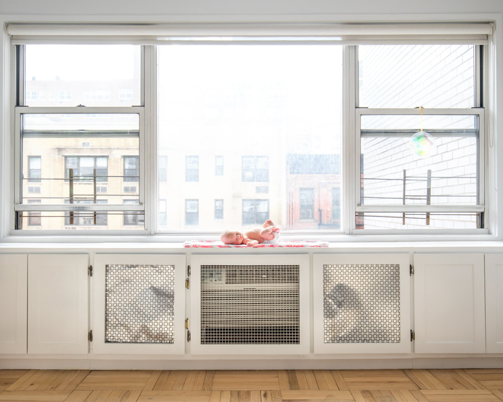     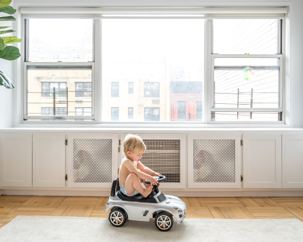 
2 Comments
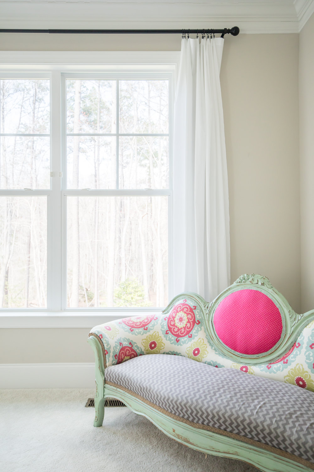
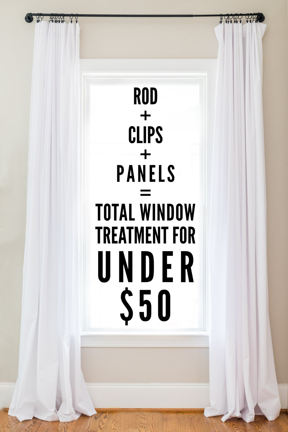 No, this blog isn't just about curtains anymore. But after the response to my previous post about $7 curtain panels, I couldn't help sharing one more variation. At 10 feet, our living room ceiling is slightly higher than our bedroom ceiling. I wanted to find longer panels than the ones I used in the bedroom to add height and brightness to the north-facing living room. (I was also dying to hide the insane number of outlets and switches surrounding the fireplace.) Here are the before photos of our living room: 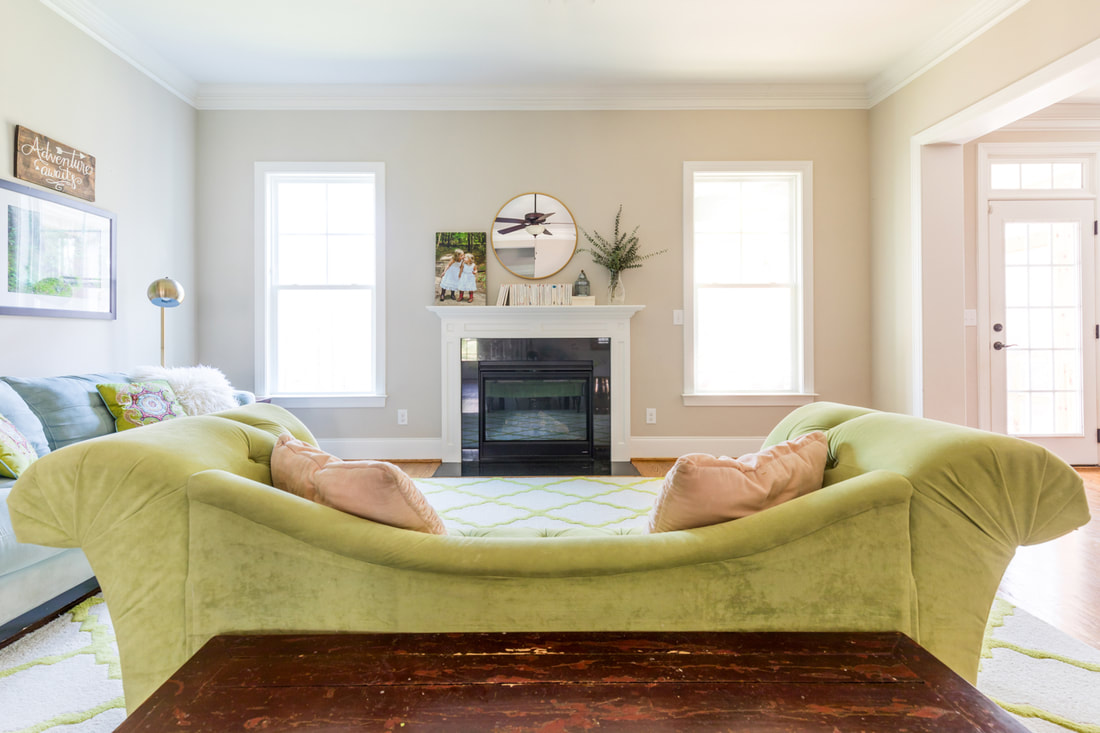 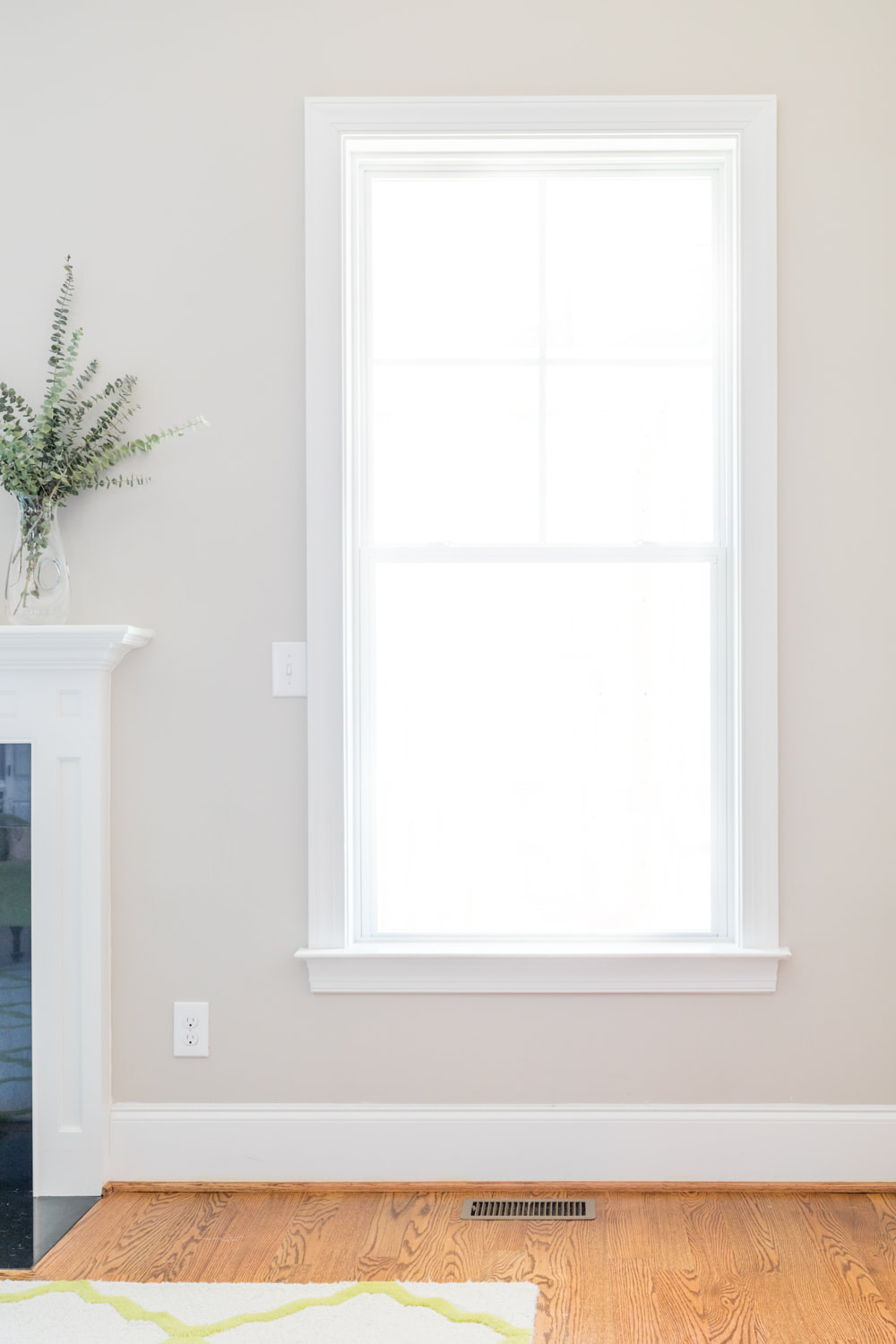 The secret is these curtains aren't actually curtains; they're these XL queen sheets. I paired them with this rod and these clips. The full window treatment cost under $50 per window! (Note the sheets were listed as 110 inches long, but once I washed and dried them on low, I measured them to find they were 107 inches.) You can find my tips for hanging curtains for maximum impact here. I wanted to add height to this room by hanging the rods close to the ceiling but didn't want to hide the pretty, thick moulding. By hanging them a few inches below the moulding, both the interesting rods and the moulding are still visible. These curtain panels and hardware are an affordable way to complete any room. Let me know if you try them out! 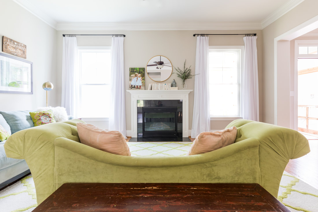 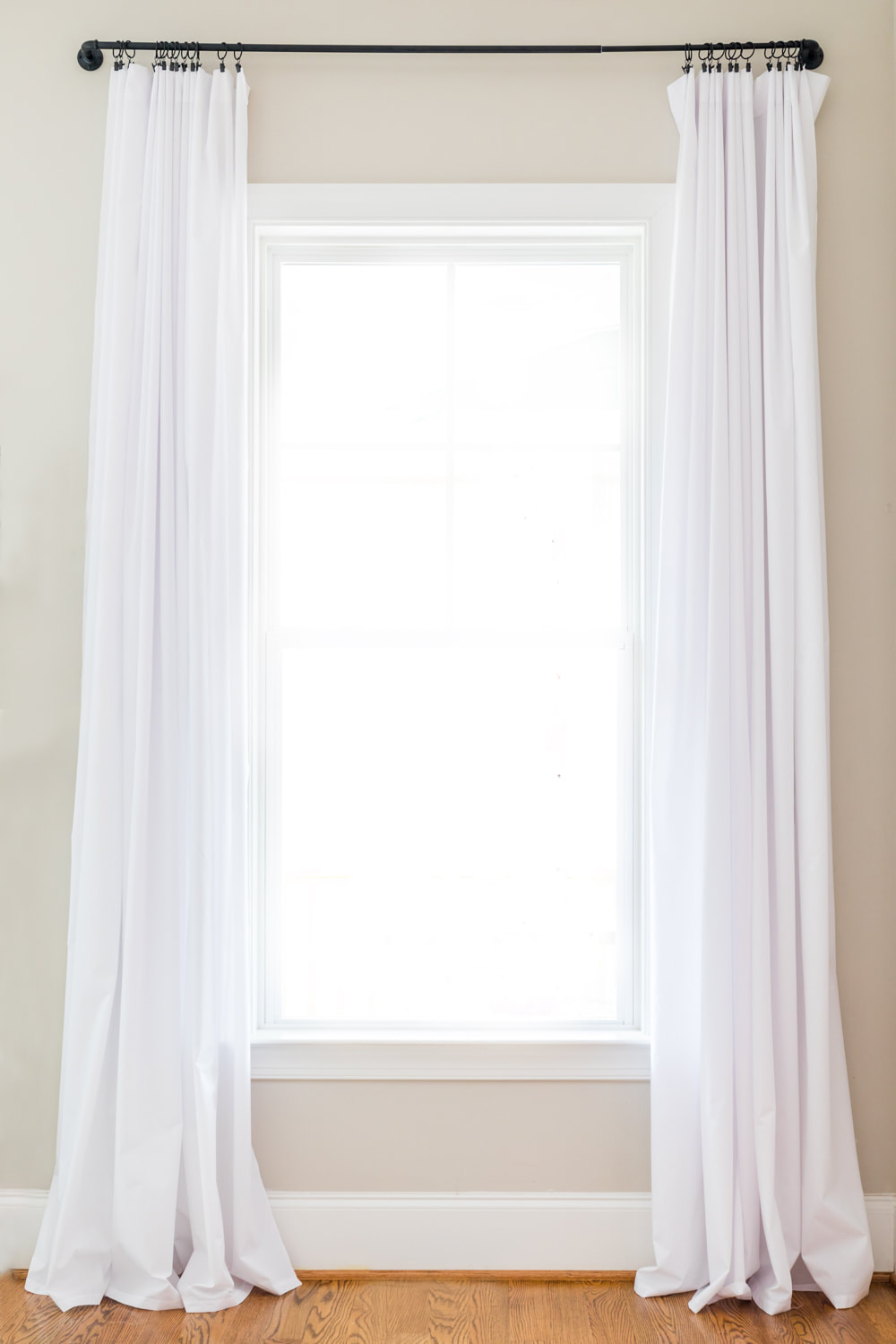 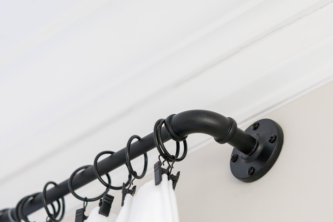    I'm not ashamed to admit I have a nearly pathological inability to pay for things I could make myself or find elsewhere for less. Even so, I'm almost embarrassed to share this find. Why? Because I sort of want to use these glamorous curtains to trick people who come to our house into thinking I've moved passed my pathological ways. Alas, my condition also makes me feel the need to share my decor secrets with others who suffer from the same affliction. So I'm laying bare my taste for $7 curtains for all to see. Here are the before photos of our bedroom sans curtains. (These photos appeared in my Design Mom home tour last spring. Still swooning over that experience.) 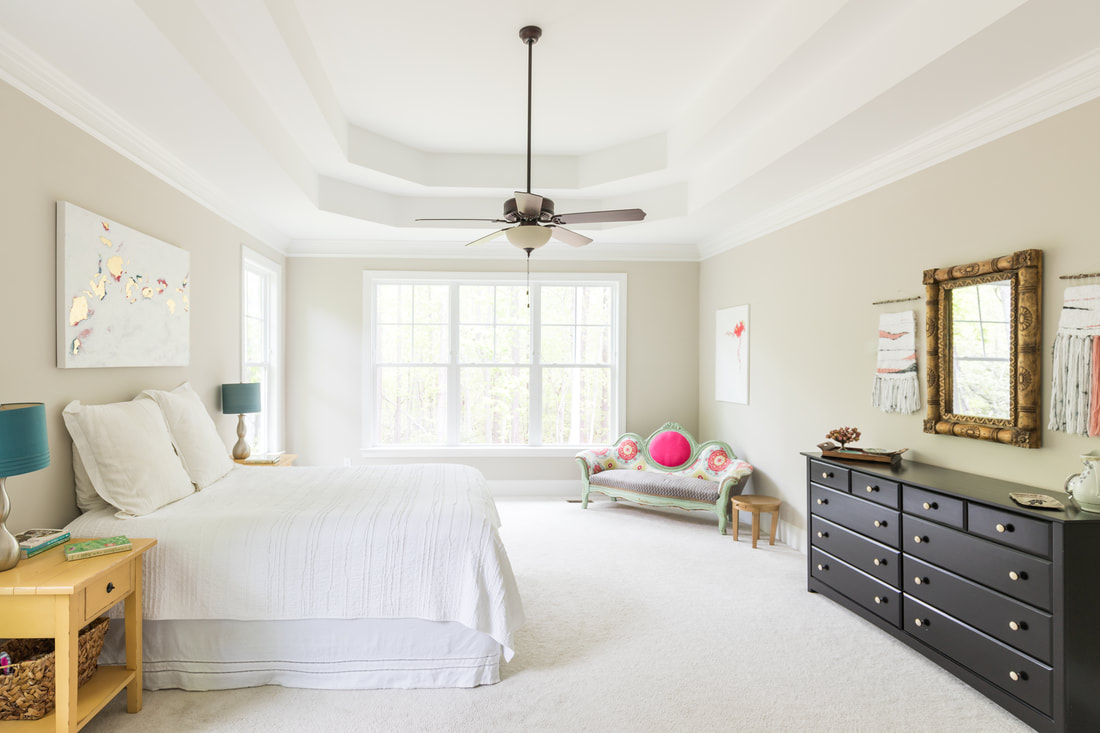 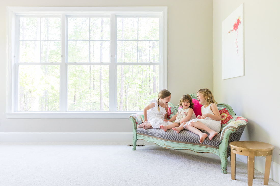 Here's the room with my $7 curtain panels. Now the dirty little secret is...they aren't actually curtain panels at all. They're these extra-long twin sheets, which come in a pack of six. Their weight is somewhere between a sheer and a traditional drape, so they’re perfect if you want a light, airy curtain but not if you need substantial privacy or black-out shades. 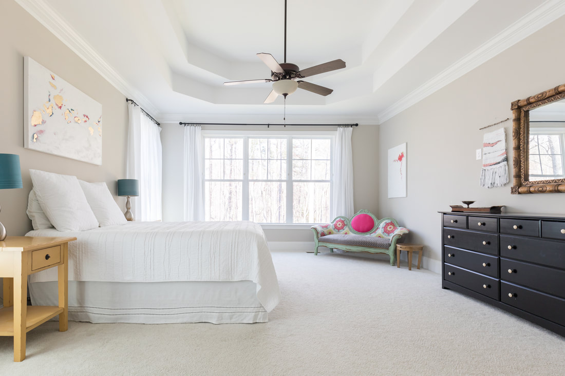 (No sweet models on the sofa this time.) For the wide window, I paired them with this classic curtain rod. 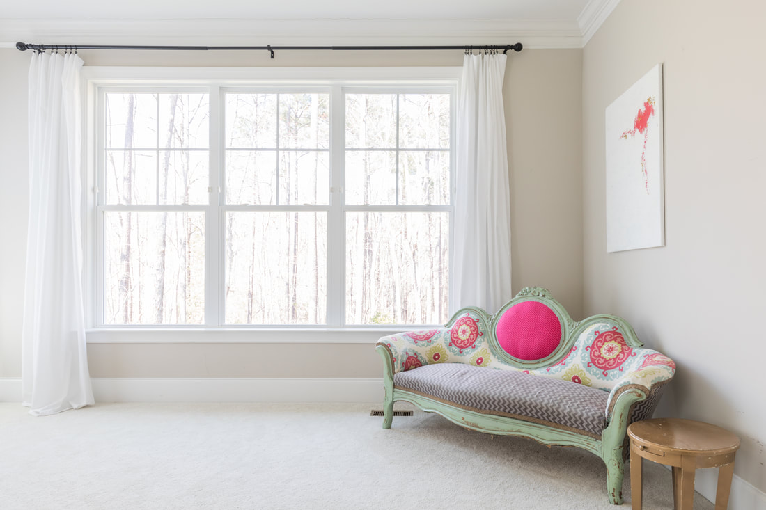 For the single windows next to the bed, I used this curtain rod. (I especially love this one and will be using it for living room curtains, too.) While the curtain rods are thin enough to slip through the top seam of the curtain, I chose to attach them using these clips both for aesthetics and to make it easier to slide the panels.  TIPS FOR HANGING CURTAINS FOR MAXIMUM EFFECT
  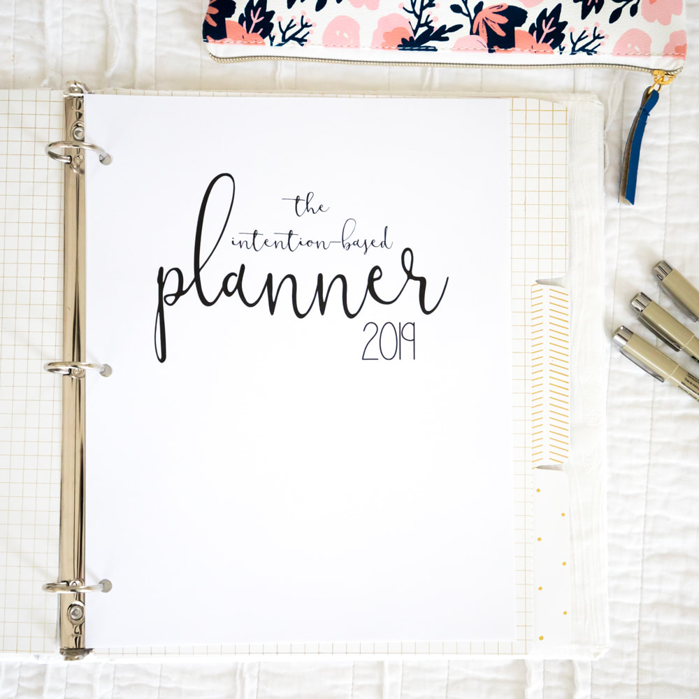 It's done! It's done! Earlier this year, my sister, Mari Melby, asked me to design a printable planner with her. It's been a labor of love...and of fancy pens drying out and printers gone awry, but The Intention-Based Planner officially launches today! You can find it here, just in time to treat yourself and your loved ones to a new year of more intentional living. Plus it's on sale through the end of December. Here are the details:
The idea for The Intention-Based Planner grew out of our desperate desire to simplify, focus, and live more intentionally. We were finding ourselves playing constant defense against a barrage of tasks and commitments—never ahead of the game, never feeling in control of our time. We were furiously scribbling post-it notes and sticking them to every surface as reminders, to-dos, and brainstorms, only to lose track of them and the information they contained. We were juggling life and work ineffectively, and our commitments were draining our energy instead of replenishing it. So we set out to design a planner that would help us stop needing to perform logistical miracles with our time and start living with more intention—start saying no, start reducing energy-draining elements, start making more room for the aspects of life that energize us. What we call a planner is actually part planner; part journal; and part log of events, projects, and travel. Despite technological advances, we still remember things best when we physically write them out and can flip back and forth between paper pages instead of scrolling down a screen. So we knew we wanted a printable planner and modeled it after the popular bullet journal (but for people who aren’t looking to design and draw every page on their own). The planner incorporates both hand-drawn and digital elements, leaving plenty of bulleted blank space for you to write or sketch ideas. We recommend printing the main planner double-sided. You may prefer to print the project planner, travel planner, and task list single-sided, as needed. Use a 3-ring binder with dividers to separate the sections. The Intention-Based Planner The intention-setting and reflection prompts occur annually and seasonally. You’ll find these pages interspersed with the monthly and weekly calendar pages. Take a few minutes at the beginning of each season to record your intentions, then try to organize the season around them. Be sure to take time at the end of each of season to reflect on what helped or hindered you from in living your intentions.
Project Planner Use this element to record ideas for any type of project: a room you want to renovate, an essay you plan to write, an event you’re throwing. Jot it down and keep all your ideas in one place. No more lost sticky notes! Travel Planner Keeping an organized record of travel goals, to-dos, itineraries, and packing lists not only makes trips run more smoothly but also simplifies future expeditions. Don’t throw out your packing lists! Just amend them for your next adventure. The travel planner includes:
Task List Instead of scribbling notes to yourself around the house, keep a running master task list in one place. We hope The Intention-Based Planner will help you live your best life—one with more intention, focus, and energy. Best wishes, Mari & Julia P.S. You can snag your planner here. 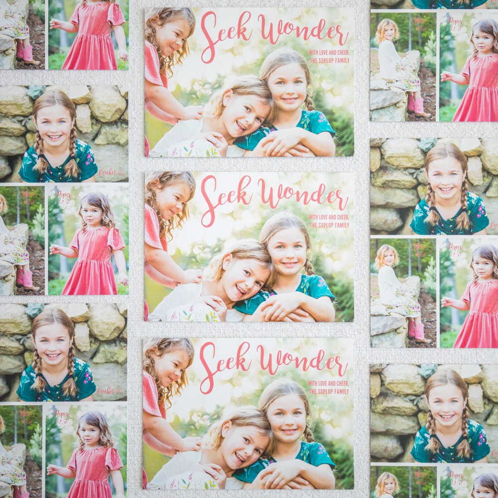 Exchanging holiday cards is one of my favorite parts of December. As a lifestyle photographer, I always aim to take portraits that show the girls authentically in a place that has been a special part of our lives that year. We took these photos on the stone wall we had built in the front yard with rocks from our property. "Seek wonder" felt like the perfect wish for the year, since my underlying goal as a parent and home educator is not to extinguish the girls' natural sense of wonder with the drudgery of formal education, but to provide natural opportunities for it to continue to grow. I hope you'll enjoy the card and outtakes. Happy Holidays to you and yours! Front of card:  Back of card:  Now for the outtakes. The first one below is probably my favorite, though it's hard to say. It looks like Piper is placing a spell on her sisters, when actually she is throwing pine straw all over them in an effort to foil my attempts at capturing one civilized photo. (Portraits with 2-year-olds are always a trip, aren't they?)        

    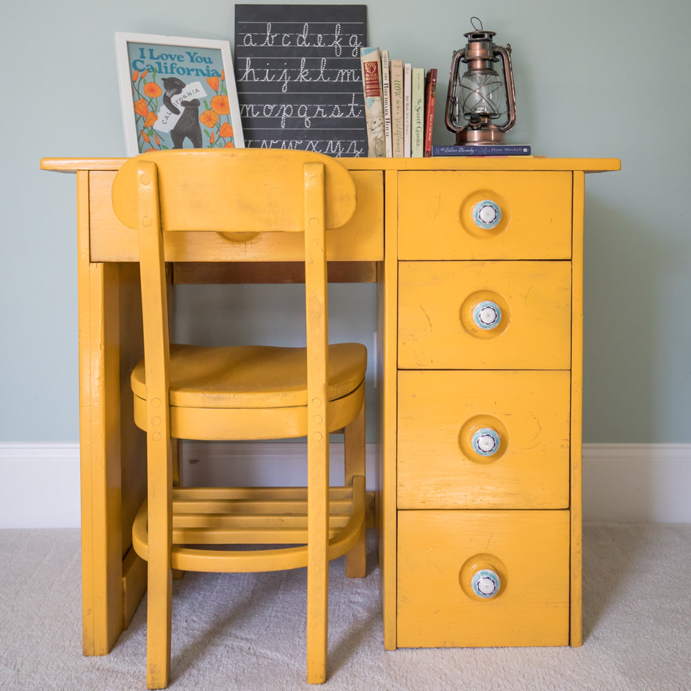 When our dear friend, Alice, was moving out of the area years ago, she gifted us with her childhood desk. Her wood-working aunt had made it for her, and she was ready to pass it along for another child to love. Cricket became the recipient of the desk when we moved into this house three years ago. The desk was due for a refinishing, and it seemed like a fun birthday present for Cricket to make the project happen this month. She chose this marigold spray paint to match a sunflower photo from a favorite hiking trail in Colorado that hangs on another wall in her room. I surprised her with these Anthropologie knobs. To prepare the desk and chair for spraying, I just did a quick sanding. I wanted to preserve some of the wood grain and dents to retain the history and vintage feel, so I didn't worry about smoothing the surfaces or spraying more than a few coats of paint. (I escaped without de-glossing, because the finish was so worn.) Cricket couldn't be happier with how it turned out. I hope she'll be able to pass it down to her kids one day. 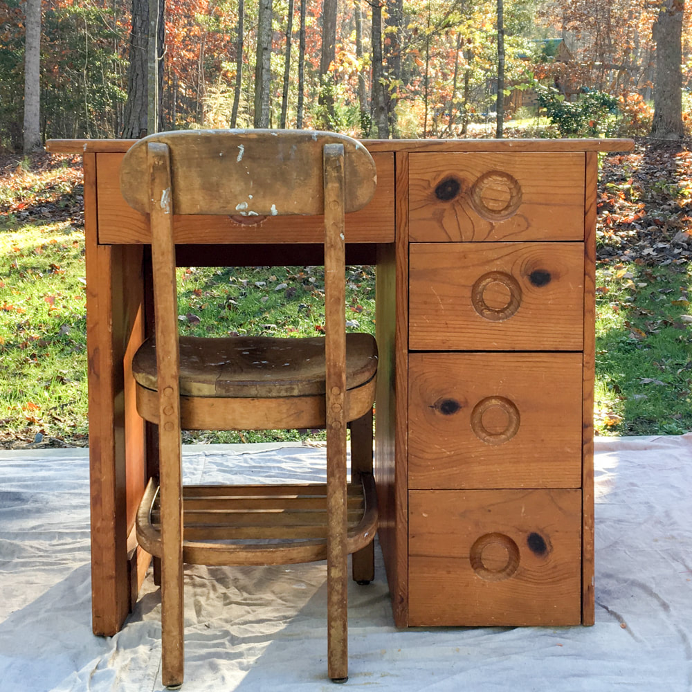 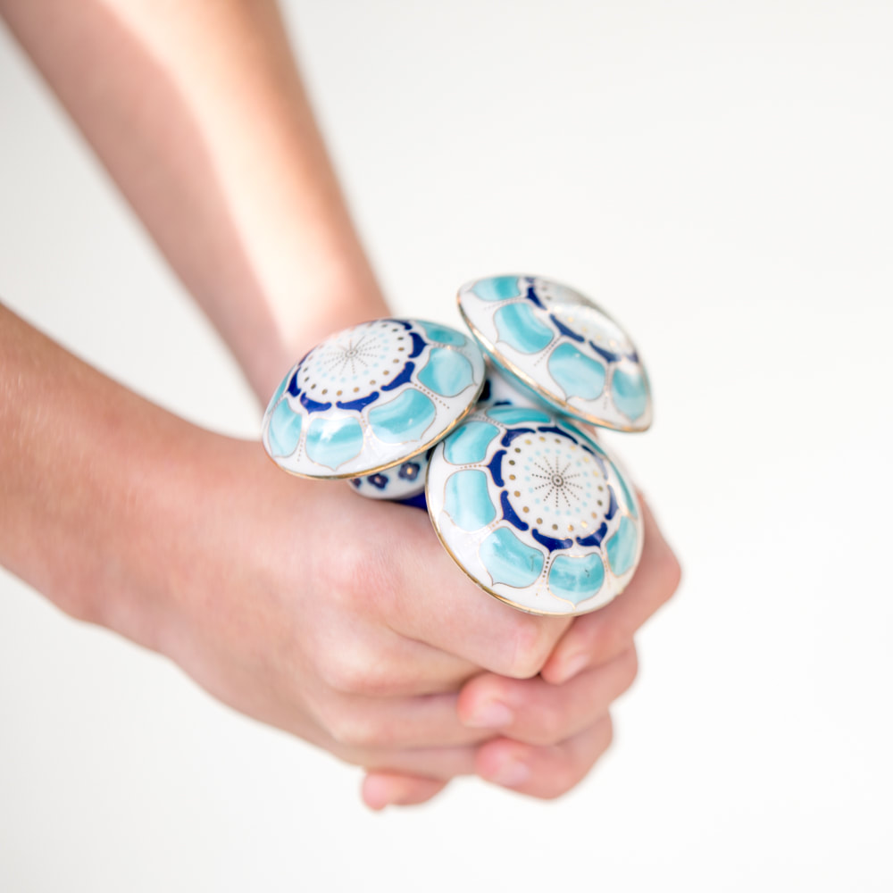 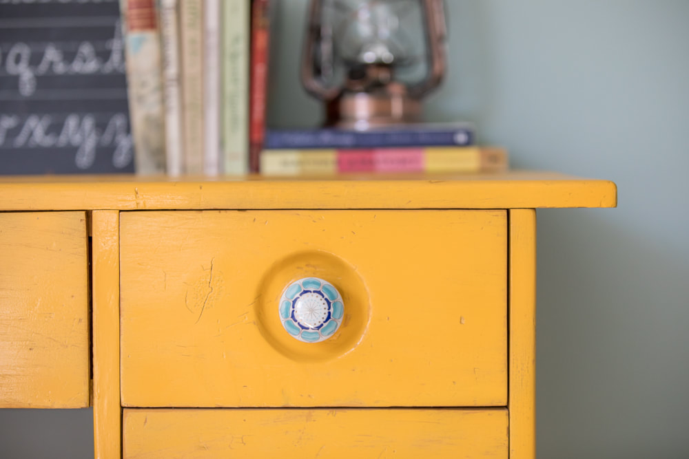 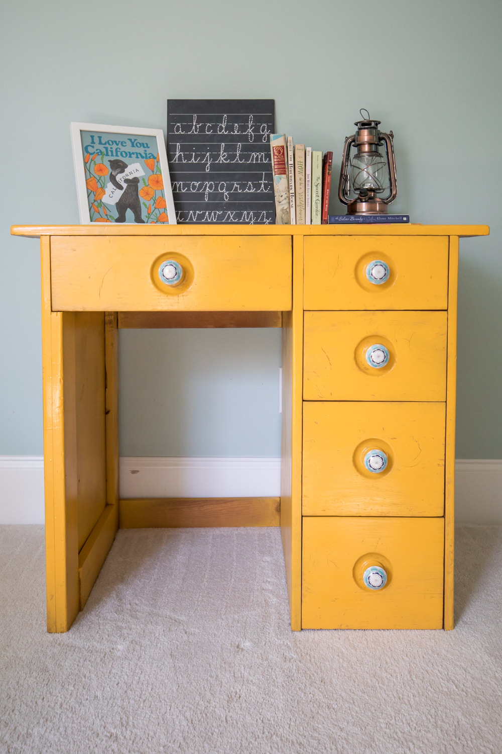 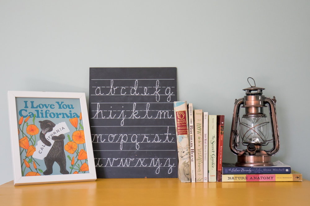 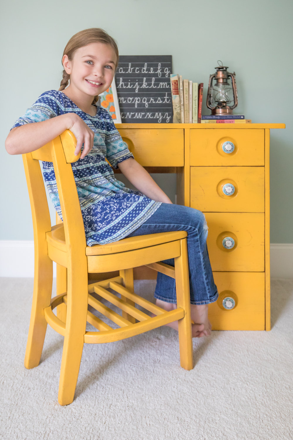 
Remember that time long ago (in May) when Design Mom featured my home tour? I'm still pinching myself in disbelief that it ever happened. And I'm still getting a lot of questions about the frames lining our upstairs hallway from one of the photos that appeared in the post.
So I'm going to let you in on a little secret, which isn't actually a secret if you know me: I'm a cheapskate. I don't care about brands. I don't buy an expensive version of something when I can buy an inexpensive version. And I don't mind rolling up my sleeves and making something if it means it will fit my budget now instead of two years from now. This long hallway wall sat empty for a long time before I finally decided what to do with it. It doesn't get a lot of light, so I knew the art needed to be bright and reflective. I also wanted a simple, sharp, clean feel that drew the eye down the hall to the colorful piece that local artist Jenn Potter painted for that space. Eventually I decided small black and white prints with large white mats (plenty of negative space) checked off all my requirements. Designers often work in odd numbers, but I just couldn't figure out how to make the wall work with three or five frames, so I settled on four. (If you have a choice, go odd.) When I looked into custom framing four small prints with 24x36-inch mats, it was going to cost me in the neighborhood of $1,000. No, ma'am. I frame way too much in a given year to spend $1,000 on one wall. So I headed to a hobby store and went to work trying to create the same look for a fraction of the cost. I ended up framing all four prints for around $120 total. Here's how I did it. 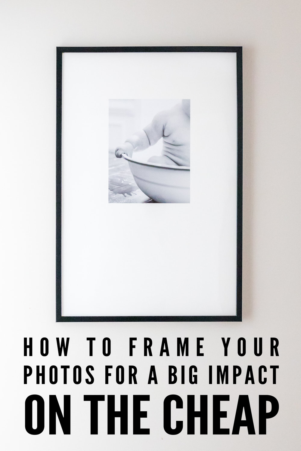
Supplies
Poster frames with thin black borders (24x36)—$12.99 each White mat board for each frame at least 24x36 inches (uncut)—$7.99 each Prints (11x14)—$5.00 each Spray mount adhesive—$5.99 Scissors or crafting knife Measuring tape or yard stick Pencil Process I bought the inexpensive poster frames and uncut mat board at A.C. Moore (which doesn't list their inventory online). You can find similar supplies at other hobby stores, such as Michael's. The mat board was larger than 24x36, so I carefully measured and cut the outer edges to size to fit the frames. Instead of cutting windows in the mat board (which is difficult and frustrating without good supplies), I glued the photos on top of them. Guests to my home haven't noticed this shortcut, even upon close inspection! To do this, I measured and marked in pencil (and double and triple and quadruple checked) where I wanted to place the photos: 6.5 inches from the top and 6.5 inches from each side. Next I set up a place to spray the adhesive on the backs of the photos (in a well-ventilated area), sprayed them, then placed the photos extremely carefully onto the mat board where I had marked. There is a lot of room for error here, so you may want to purchase an additional mat board in case you make a measuring or gluing mistake. I assembled the frames. Normally I hang frames about two inches apart. But to continue the theme of negative space and keep the eye moving down the hallway, I spaced the frames 13 inches apart. Voila. You've got yourself a series of art for a fraction of the cost of custom framing. In other news, check out my new photography class! “Documenting Your World Through Photography: An Introductory Course for Elementary and Middle Schoolers”is an 85-page downloadable PDF packed with lessons and photo examples from my own portfolio. 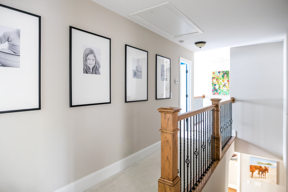
 Happy Advent! In the South, the front porch is an art form. We finally have one to call our own, but it sat sadly untouched for more than a year after we moved in. No more. I've scoured Pinterest for simple holiday decor inspiration to accent our green exterior and settled on the classics. Red and white. White and red. I think our house was made for Christmas. (You can find the source list below.) When I asked Jeff to help hang the garland, he wondered how I wanted it to look. My response: "Well, I just want it to be meticulous and perfect." He doubled over laughing. (My M.O. is perfection; his is efficiency.) But he pulled it off quite nicely, don't you think? 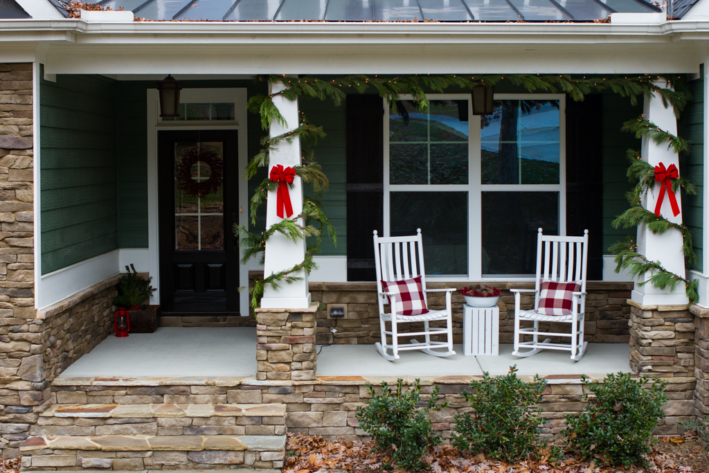 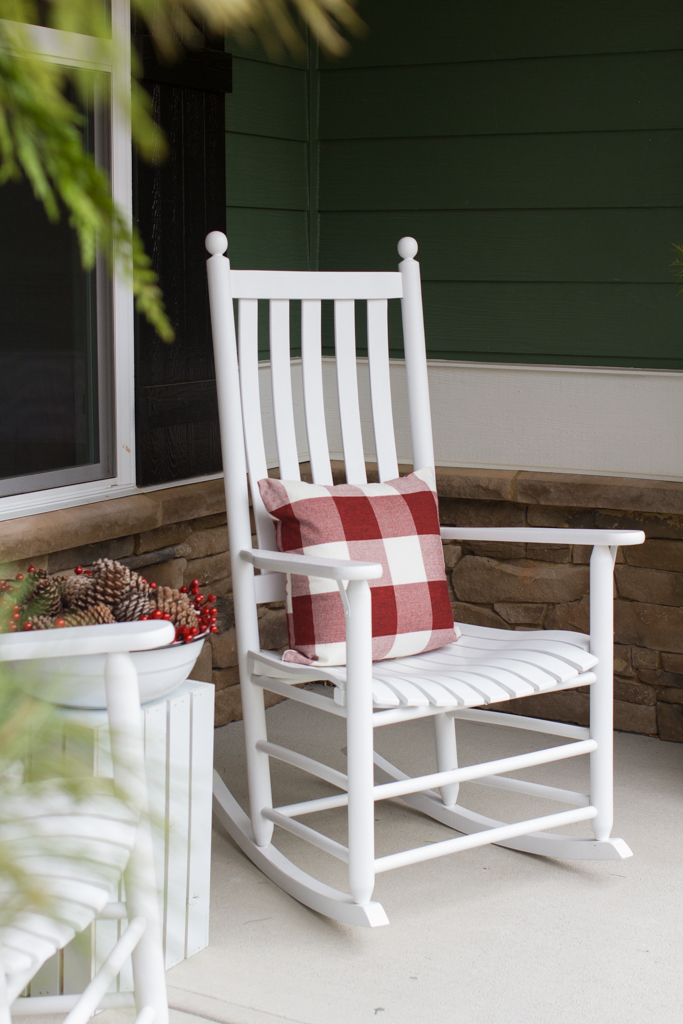  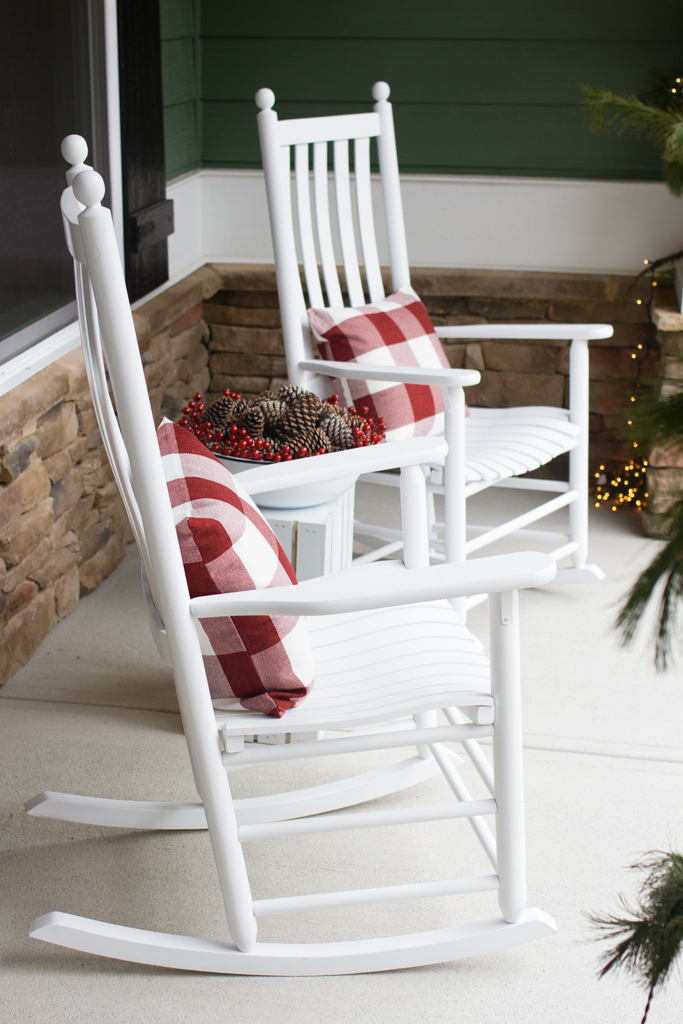 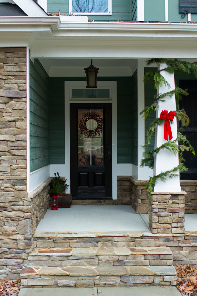 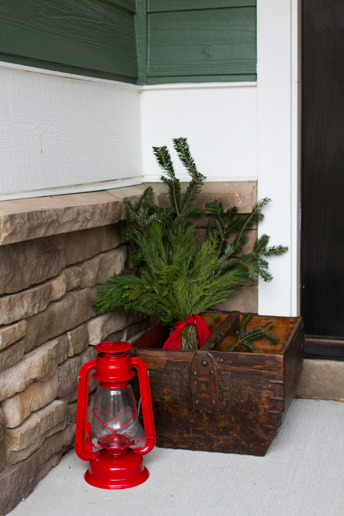 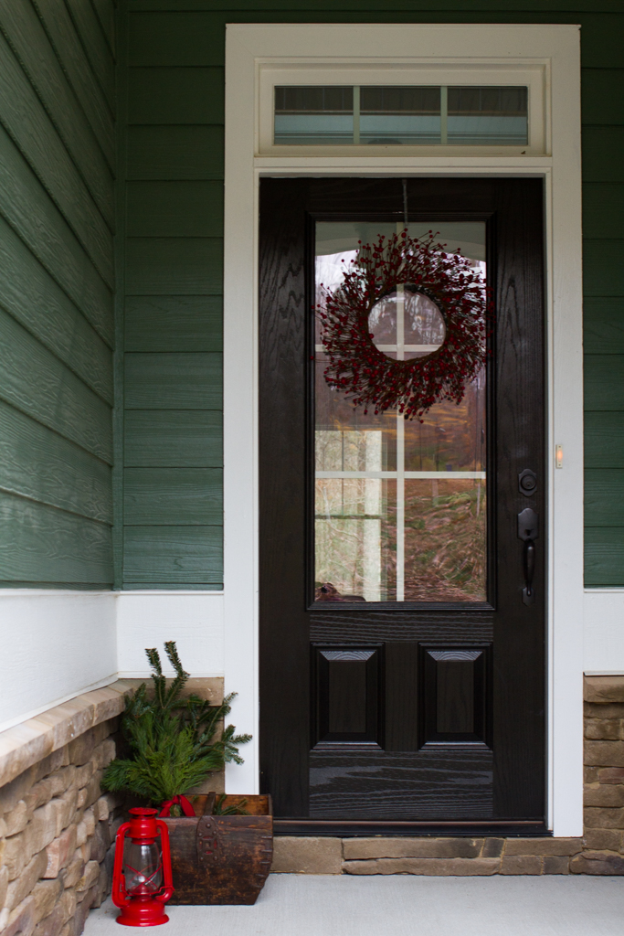 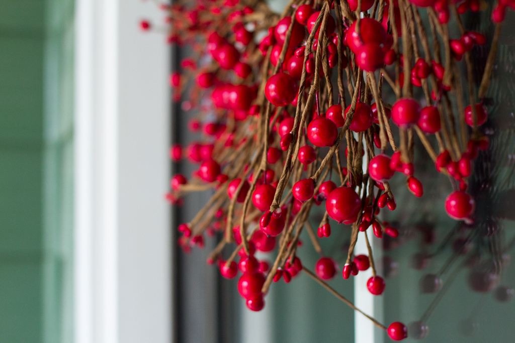 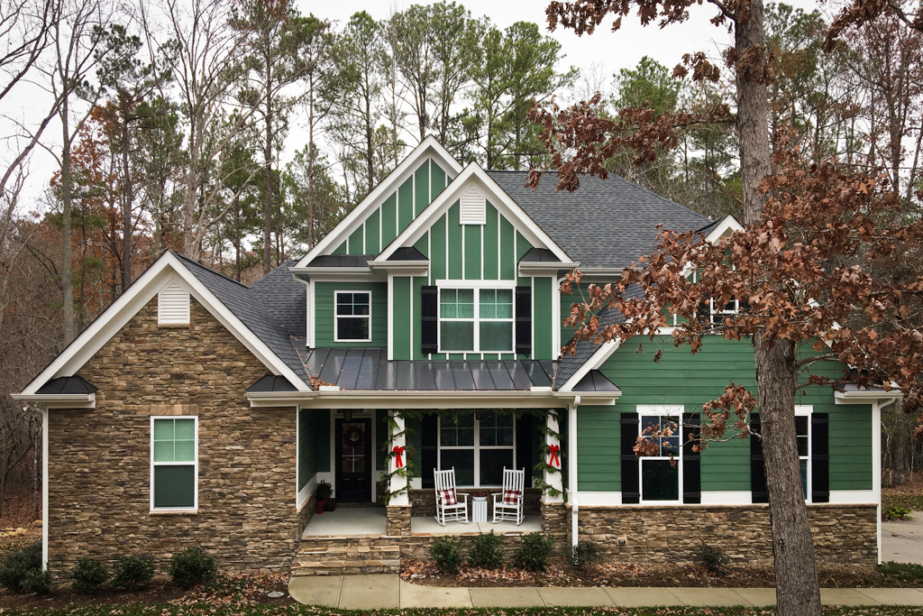 Source list
White rocking chairs Red and white plaid pillow covers White enamel bowl (also used for baby bath photos) Crate (plus white spray paint) Red berry wreath Red lantern Pinterest inspiration 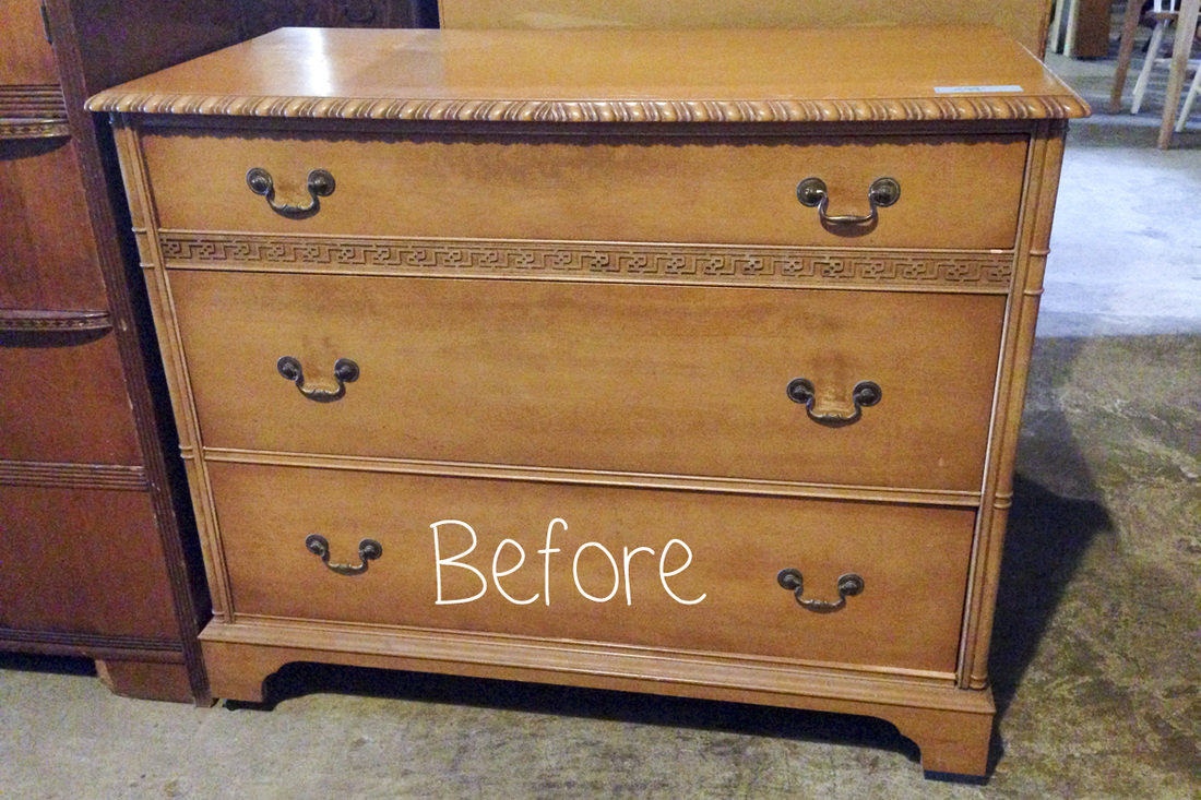 We've refinished a dresser for each of our kids and hope these unique pieces will last their childhoods. Perhaps they'll even hold up long enough to be passed to their own kids. Each dresser came from a crazy secondhand warehouse in Raleigh called Shelton's Furniture. You can find the first dresser here and the second here. Jeff painted the white dresser, and we actually found a guy to finish the blue one for just $100. Who could say no to that? Since sanding is annoying in general and terrible during pregnancy, I decided to try my hand at chalk paint for the first time. The original brand, Annie Sloan, is expensive and a hassle to find, so I tried Rust-Oleum's new product, which is almost half the price and available at Home Depot. Mistake! I do not recommend it. Somehow brown streaks kept appearing after the paint dried no matter how many coats I layered on. I'm not sure if it was the interaction of the paint or clear finish with the stain underneath or what, but I won't be buying this product again. There are still a couple small brownish spots that I think I'll go back over with a white wood paint marker. That said, I will definitely use chalk paint again in the future. It's probably worth the extra cash and time to get Annie's though. Voila the after shot: 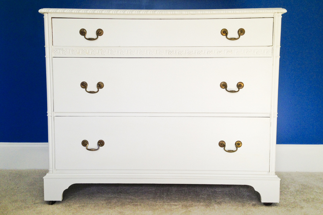 And here's a little sneak peek of one side of the nursery. Wall paint by Jeff (Benjamin Moore's Blueberry), chalk paint dresser by yours truly and beautiful 36 x 48-inch artwork by my favorite creative duo, Cricket and Nora. They painted this picture about two years ago, and we hung it in the dining room of our previous house. They loved the idea of placing it in the nursery as a gift for the baby. 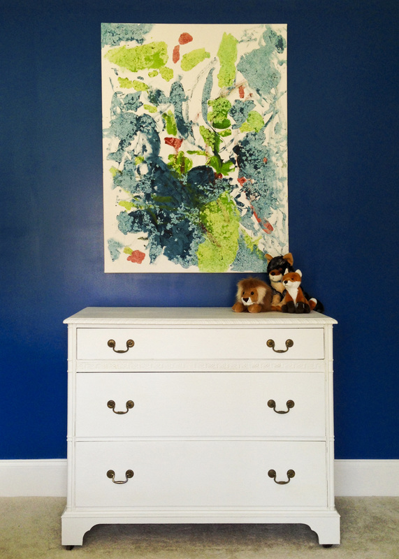  Happy Holidays from my family to you and yours! We wish you time with your loved ones, good health and, above all, peace.  |
My new book is out! Click to learn more about it.
Hello there
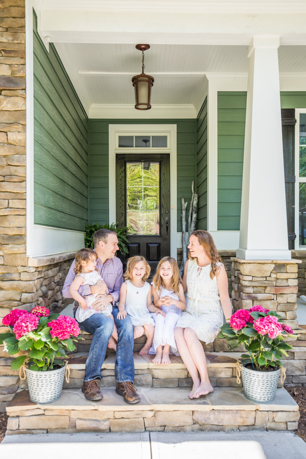
I'm Julia Soplop, writer and photographer. I believe there is something profound in bearing witness to moments of joy and pain in others’ lives. My husband, three girls and I live outside of Chapel Hill, NC. You can read more about me here.
Snag my new photo curriculum for kids!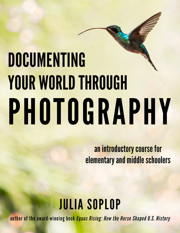
Categories
All
Popular posts |